The design of devices and environments for individuals with dementia places great significance on “color” and “shape.” This is due to the visual and perceptual challenges that the elderly and individuals with this condition often face, affecting their ability to navigate daily life. Design, therefore, serves a purpose beyond aesthetics and emotions, as it facilitates the use of assistive technologies that promote independence, safety, and well-being for people with dementia.
The form of design aligns with ergonomic principles to enhance safety and promote a sense of self-assistance. Design details, such as selecting color hues or contrasts for equipment and environments, have a positive impact on vision, mobility, and other daily activities for individuals with dementia.
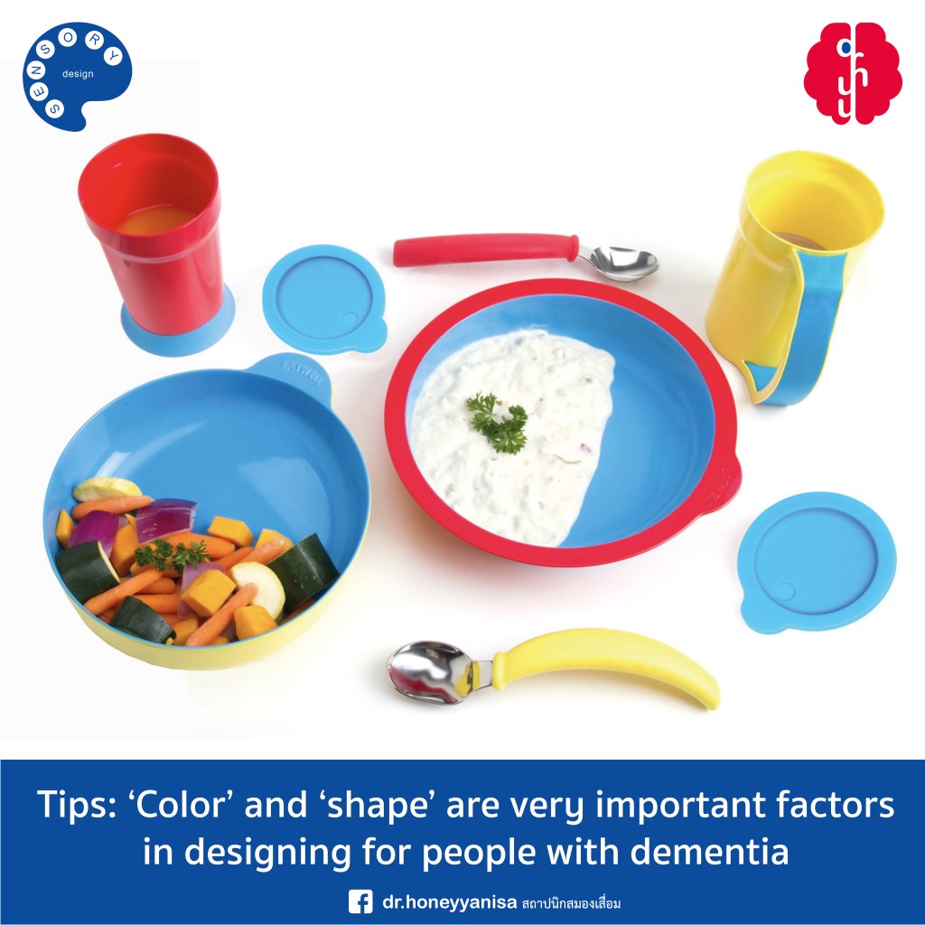
An illustrative example is the EATWELL project initiated by product designer Sha Yao, inspired by her grandmother’s experience with dementia. Sha Yao conducted extensive research and observation of users over many years to develop dining products, including plates, bowls, and glasses, employing a user-centered design approach that considers the well-being and dignity of the users while alleviating the caregiving burden and facilitating the eating process.
The incorporation of color contrast further enhances visibility. By differentiating the color between the interior and exterior of the bowl, users can more easily distinguish the food from the bowl, mitigating the frustration and confusion often experienced by individuals with dementia when the food blends into a white plate.
The bowl itself features a specialized design with a recessed area at the bottom, allowing food to accumulate and facilitating scooping for users. The spoon is specifically designed to fit the curve of the bowl, reducing messiness and accommodating the natural size of the hand. Additionally, the coaster, made of rubber material, prevents accidental tipping of the glass during mealtime.
From this example, it becomes evident that “color” and “shape” play integral roles in the design process for individuals with dementia. Designers must consider these factors when developing products and creating supportive environments, enabling individuals with dementia to maintain as much independence as possible in their daily lives.
.
สีและรูปทรง
Design Tips: ‘สี’ และ ‘รูปทรง’ เป็นปัจจัยที่สำคัญมากในการออกแบบสำหรับผู้ที่มีภาวะสมองเสื่อม #มากกว่าความสวยงามนะจ๊ะ
‘สี’ และ ‘รูปทรง’ เป็นปัจจัยที่สำคัญมากในการออกแบบอุปกรณ์และสภาพแวดล้อมของผู้มีภาวะสมองเสื่อม เนื่องจากผู้สูงอายุหรือผู้มีภาวะนี้จะมีปัญหาในเรื่องของการมองเห็นและการแยกมิติ ซึ่งส่งผลต่อการช่วยเหลือตัวเองในชีวิตประจำวัน การออกแบบจึงไม่ได้จำเป็นต่อมนุษย์ในแง่ของความสวยงามและความรู้สึกเท่านั้น แต่การออกแบบยังช่วยส่งเสริมการใช้งานของอุปกรณ์ เช่น เทคโนโลยี (assistive technologies) ที่สามารถช่วยเหลือผู้ที่มีภาวะสมองเสื่อมในการดำรงความเป็นอิสระ ความปลอดภัย และความเป็นอยู่ที่ดี
รูปทรง (form) สามารถตอบโจทย์ในส่วนของการออกแบบตามหลักสรีรศาสตร์ (ergonomics) เพื่อส่งเสริมความปลอดภัยและความภูมิใจในการช่วยเหลือตัวเองให้มากยิ่งขึ้น โดยรายละเอียดของการออกแบบเช่น การเลือกเฉดสี (colour hue) หรือสีที่ตัดกัน (colour contrast) ของอุปกรณ์และสภาพแวดล้อม ยังส่งผลดีต่อการมองเห็น การเดิน และการใช้ชีวิตประจำวันอื่นๆ ของผู้ที่มีภาวะสมองเสื่อมอีกด้วย
ตัวอย่างเช่น โปรเจกต์ EATWELL โดยคุณ Sha Yao นักออกแบบผลิตภัณฑ์ ที่มีคุณย่ามีภาวะสมองเสื่อม ได้ค้นคว้าและสังเกตการณ์ผู้ใช้งานเป็นระยะเวลาหลายปี เพื่อออกแบบผลิตภัณฑ์สำหรับการรับประทานอาหาร (ได้แก่ จาน ชาม และแก้วน้ำ) โดยมีเป้าหมายคือการออกแบบที่เน้นผู้ใช้เป็นศูนย์กลาง (user-centred design) ซึ่งคำนึงถึงความเป็นอยู่ที่ดีและศักดิ์ศรีของผู้ใช้ ในขณะเดียวกันก็ช่วยแบ่งเบาภาระการดูแล ทำให้ขั้นตอนการรับประทานอาหารเป็นเรื่องง่ายยิ่งขึ้น
การเพิ่มการตัดกันของสี (colour contrast) สามารถเพิ่มการมองเห็นให้ได้มากยิ่งขึ้น ความแตกต่างของสีระหว่างภายในและภายนอกของชาม ทำให้ผู้ใช้งานสามารถแยกแยะอาหารออกจากชามได้ ซึ่งโดยปกติแล้ว จานสีขาวจะทำให้ผู้มีภาวะสมองเสื่อม รู้สึกหงุดหงิดและสับสนกับตำแหน่งของอาหาร
ชาม มีลักษณะพิเศษคือ จะมีแอ่ง ซึ่งช่วยให้อาหารรวมตัวกันที่ก้นชาม และทำให้ผู้ใช้ตักได้ง่ายขึ้น ช้อนได้รับการออกแบบมาให้พอดีกับส่วนโค้งของชาม ซึ่งช่วยลดการหกเลอะเทอะ และยังพอดีกับส่วนโค้งตามธรรมชาติของขนาดของมืออีกด้วย และการออกแบบฐานรองแก้วที่ทำด้วยวัสดุยาง ยังช่วยป้องกันอุบัติเหตุจากการล้มของแก้วน้ำ (anti-tip design) ระหว่างรับประทานอาหาร
ป.ล. จากตัวอย่างทำให้เราเห็นว่า ‘สี’ และ ‘รูปทรง’ เป็นปัจจัยที่สำคัญมากในการออกแบบสำหรับผู้ที่มีภาวะสมองเสื่อม นักออกแบบควรคำนึงถึงปัจจัยทั้งสองระหว่างการออกแบบผลิตภัณฑ์และสภาพแวดล้อม เพื่อให้ผู้มีภาวะสมองเสื่อมสามารถใช้ชีวิตประจำวันด้วยตัวเองให้ได้มากที่สุดค่ะ
.
เขียน โดย ดร.ญาณิศา เนียรนาทตระกูล
#sensorydesign#การออกแบบภาวะสมองเสื่อม#สถาปนิกสมองเสื่อม#eatwellDr.honeyyanisa สถาปนิกสมองเสื่อม
